-

- Brand/Project Name
- Navigation Menu
- Component Variant
- Change Layout(RTL) and Theme
- Youtube Config
- Set Language
Brand/Project Name
- Open
/public/text/brand.js -
Here's bellow the available brand attribute
module.exports = { starter: { name: 'Oiron Starter', desc: 'Oiron Starter - React Starter Template', prefix: 'Oiron', footerText: 'Oiron Theme All Rights Reserved 2021', logoText: 'Oiron Theme', projectName: 'Starter Project', url: 'oiron.ux-maestro.com', img: '/public/images/logo.png', notifMsg: 'Donec sit amet nulla sed arcu pulvinar ultricies commodo id ligula.' } }; - Those attribute will affect in HTML ‹head› content and other branding name
Component Variants
This template come with some variant main components that easy to use.
To change Header, Footer, and Corner component, please open in theme config theme/config.js, and just change value then all components will be updated.
Here's the available values:
| Key | Type | Available Value | Example |
|---|---|---|---|
Header |
String |
mixed,
basic,
droplist,
mega,
hamburger,
navscroll,
search
|
header: 'mixed' |
Header |
String |
basic,
sitemap,
blog,
contact
|
footer: 'blog' |
Footer |
String |
chat,
nav
|
corner: 'chat' |
Header
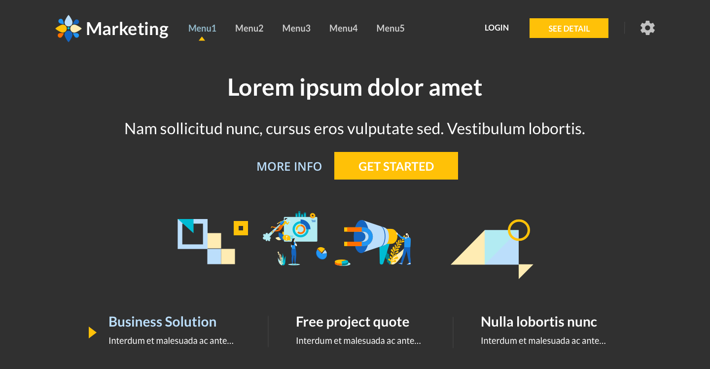
Header component used for navigation and some site settings. It's more flexible with 7 type of headers:
- Basic:
basic - Search:
search - DropList:
droplist(it has routing navigation) - MegaMenu:
mega(it has routing navigation) - Hamburger Menu:
hamburger(it has scroll navigation) - Scroll Navigation:
navscroll(it has scroll navigation) - Mixed:
mixed(Scroll Navigation + Mega Menu)
In theme/config.js you can edit header value to change the header type.
The changes will affected to all pages containing header except Blog and Auth (login & register).
// theme/config.js
export const state = () => ({
  header: 'mixed', /* available: mixed, basic, droplist, mega, hamburger, navscroll, search */
})
Mega menu and Dropdown menu have submenu that can be accessed by clicking the parent menu. But It can be accessed using hover instead of clicking by change the data.
-
*For Droplist.js you have to import
MultiLevelcomponent fromTopNav/MultiLevelHover.js// components/Header/Droplist.js Import MultiLevelHover./span> import MultiLevel from './TopNav/MultiLevelHover'
Footer
Footer component used for many purpose, such as navigation, contact, additional link, or just copyright mark. This template provide 4 Footer variants
- Basic:
basic - Sitemap:
sitemap - Blog:
blog - Contact:
contact
In theme/config.js you can edit footer value to change the footer type.
The changes will affected to all pages except Maintenance and Coming Soon which doesn't uses footer.
// theme/config.js
export const state = () => ({
  header: 'mixed', /* available: mixed, basic, droplist, mega, hamburger, navscroll, search */
})
Bottom Corner
The additional components for homepage placed on the bottom right corner.
There are 2 variant, Chat Panel and Single Page Navigation.
The Corner component itself imported from '~/components/Home/Corner'
import Corner from '~/components/Home/Corner'
return (
  <div>
    <Corner />
  </div>
 )
- Chat Panel:
chat - Single Page Navigation:
nav
To use it, in theme/config.js you can edit corner value to change the corner type.
The changes only affected in homepage.
By default it's only implemented in homepage, but you can use Corner component for another page
// theme/config.js
export const usState = {
  corner: 'chat' /* chat, nav */
};
Banner Slider
Banner and Slider ussualy placed on first section of hompage. And all of this template uses the Banner Slider.
The banner slider components code is in components/Home/BannerSlider
The slider containing 3 type of banners, Text-Image, Image-Text, and Text-Image-Vertical. By default it uses all type banner as horizontal slider. If you need only a single banner without slider, You have to make some modification in the code like bellow:

Text-Image
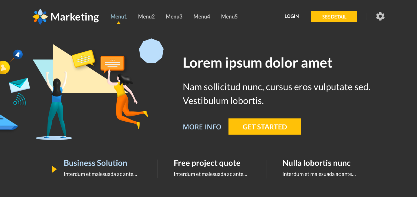
Image-Text
Text-Image-Vertical
Horizontal Slider mode structure
// components/Home/BannerSlider
<div className={classes.carousel}>
  <Carousel>
    <div className={classes.slide} id="slide1">Banner 1</div>
    <div className={classes.slide} id="slide2">Banner 2</div>
    <div className={classes.slide} id="slide3">Banner 3</div>
  </Carousel>
</div>
Single Banner mode structure
Unwrap slick component and use only one .slide element
// components/Home/BannerSlider
<div className={classes.carousel}>
  <div className={classes.slide} id="slide1">Banner 1</div>
</div>
Change Layout(RTL) and Theme
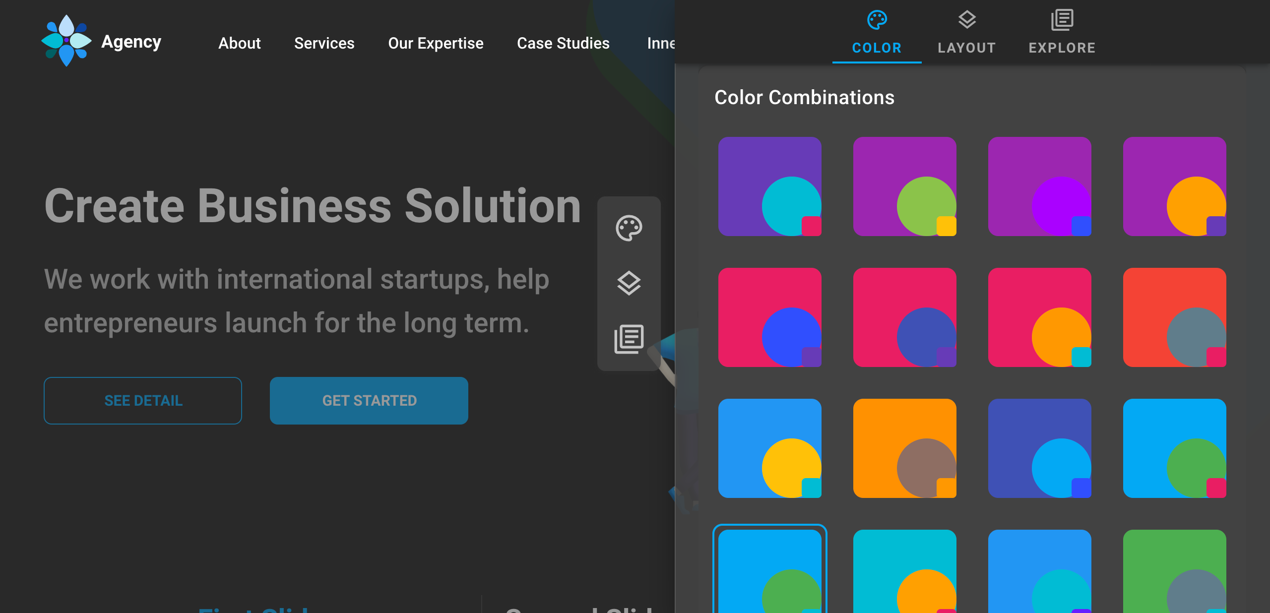
This template has 24 Themes with dark/light appearance. And also support for RTL direction. You can change the layout via theme panel but not permanently. To make the layout permanent just follow this step.
- Open
/pages/_app.js -
Then change the
state.themevalue. Here's the available api:Key Type Available Value Example Color:String 'oceanBlue','greenLeaf',
'greyscale','cloud',
'violet', etc...appTheme('oceanBlue', themeType),Theme mode:String 'light','dark',...appTheme('oceanBlue', 'dark'),direction:String ltr,rtl,direction: 'rtl'
Here's the complete code, for greenLeaf color in dark mode with RTL direction// file: pages/_app.js const [theme, setTheme] = useState({ ...appTheme('greenLeaf', 'dark'), direction: 'rtl' });
Youtube Config
This template us React Youtube a simple react component acting as a thin layer over the YouTube IFrame Player API. To use this feature we recommend to use https in production. If not there will be some warnings in browser console related cookies and security.
You can disable this feature by open /youtube.js then set set use: false.
Set Language
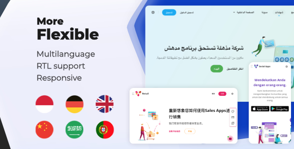
-
To set default language
- Open
/i18n.js - change
defaultLanguage: 'eng'to other initial locale i.e.indfor Bahasa Indonesia
- Open
-
Add new language
-
By default, next-i18next expects your translations to be organised as such by create new language JSON library in
/public/locales/[localCode]/└── public └── locales ├── eng | └── common.json | └── theme-landing.json └── deu └── common.json └── theme-landing.json - You can check the available local code here https://www.loc.gov/standards/iso639-2/php/code_list.php
- This template uses ISO 639-2 Code, see in first column in table
-
Then register it in
/i18n.js. Example for Deutsch.otherLanguages: ['deu'], localeSubpaths: { deu: 'de', eng: 'en' }, -
Declaring namespace dependencies in
_document.jsMyDocument.getInitialProps = async ctx => { // ...rest code return { namespacesRequired: ['common', 'landing-theme'], } })
-
By default, next-i18next expects your translations to be organised as such by create new language JSON library in
-
Put the messages to the React Components
- Choose page that one to be translated, i.e
/pages/index.js -
Then add namespace dependencies
Landing.getInitialProps = async () => ({ namespacesRequired: ['common', 'theme-landing'], }) - Pick one of sample Components with cointaining text
- Import withTranslation
import { withTranslation } from '~/i18n'; - Basically the message value is String. And next step is replace/add every string in components
-
Register
tfunction to propst: PropTypes.func.isRequired -
Add messages inside components
Or if you put all translations in common.json<Typography component="p"> {t('landing-theme:footer_counter')} <Typography><Typography component="p"> {t('common:landing-theme.footer_counter')} <Typography> -
The last step, wrap the component with
withTranslation, then open your translated page.export default withTranslation(['landing-theme'])(YourCompnent);
- Choose page that one to be translated, i.e