-
- Back to Main Docs
- Brand/Project Name
- Navigation Menu
- Component Variants
- Theme & Layout(RTL)
- Youtube Config
- Set Language
Brand/Project Name
- Open
/assets/text/brand.js -
Here's bellow the available brand attribute
const brand = { agency: { name: 'Agency', desc: 'Veluxi Agency - Vue Single Landing Page Template', prefix: 'veluxi', footerText: 'Veluxi Theme - All Rights Reserved 2023', logoText: 'Veluxi Agency', projectName: 'Agency Theme', url: 'veluxi.ux-maestro.com/agency', img: '/static/images/agency-logo.png', notifMsg: 'Donec sit amet nulla sed arcu pulvinar ultricies commodo id ligula.' } } export default brand - Those attribute will affect in HTML ‹head› content and other branding name
Component Variants
This template come with some variant main components that easy to use.
To change Header, Footer, and Corner component, please open in global store composables/uiTheme.js, and just change value then all components will be updated.
Here's the available values:
| Key | Type | Available Value | Example |
|---|---|---|---|
Header |
String |
mixed,
basic,
droplist,
mega,
hamburger,
navscroll,
search
|
header: 'mixed' |
Header |
String |
basic,
sitemap,
blog,
contact
|
footer: 'blog' |
Footer |
String |
chat,
nav
|
corner: 'chat' |
Header
Header component used for navigation and some site settings. It's more flexible with 7 type of headers:
- Basic:
basic - Search:
search - DropList:
droplist(it has routing navigation) - MegaMenu:
mega(it has routing navigation) - Hamburger Menu:
hamburger(it has scroll navigation) - Scroll Navigation:
navscroll(it has scroll navigation) - Mixed:
mixed(Scroll Navigation + Mega Menu)
In composables/uiTheme.js you can edit header value to change the header type.
The changes will affected to all pages containing header except Blog and Auth (login & register).
// composables/uiTheme.js
export const useHeader = () => useState(
  'header',
  () => 'mixed', /* available: mixed, basic, droplist, mega, hamburger, navscroll, search */
);
Mega menu and Dropdown menu have submenu that can be accessed by clicking the parent menu. But It can be accessed using hover instead of clicking by change the data.
-
In
components/Header/TopNav/MegaMenu.vueorcomponents/Header/TopNav/MultiLevel.vue -
Please change the data
hover: true -
*For Droplist (MultiLevel.vue) you have to import
Submenucomponent from./SubMenuHover// components/Header/TopNav/MultiLevel.vue // 1. Don't forget to import SubMenuHover for Droplist menu only. For Mega menu just skip thip step import Submenu from './SubMenuHover' // 2. Change the hover value to true export default { data() { return { hover: true } } }
Footer
Footer component used for many purpose, such as navigation, contact, additional link, or just copyright mark. This template provide 4 Footer variants
- Basic:
basic - Sitemap:
sitemap - Blog:
blog - Contact:
contact
In composables/uiTheme.js you can edit footer value to change the footer type.
The changes will affected to all pages except Maintenance and Coming Soon which doesn't uses footer.
// composables/uiTheme.js
export const useFooter = () => useState(
  'footer',
  () => 'sitemap', /* basic, blog, contact, sitemap */
);
Bottom Corner
The additional components for homepage placed on the bottom right corner.
There are 2 variant, Chat Panel and Single Page Navigation.
The Corner component itself imported from '@/components/Home/Corner'
<template>
  <div>
    <corner />
  </div>
</template>

<script>
import Corner from '@/components/Home/Corner'

export default {
  components: {
    Corner
  }
}
</script>
- Chat Panel:
chat - Single Page Navigation:
nav
To use it, in composables/uiTheme.js you can edit corner value to change the corner type.
The changes only affected in homepage.
By default it's only implemented in homepage, but you can use Corner component for another page
// composables/uiTheme.js
export const useCorner = () => useState(
  'corner',
  () => 'chat', /* chat, nav */
);
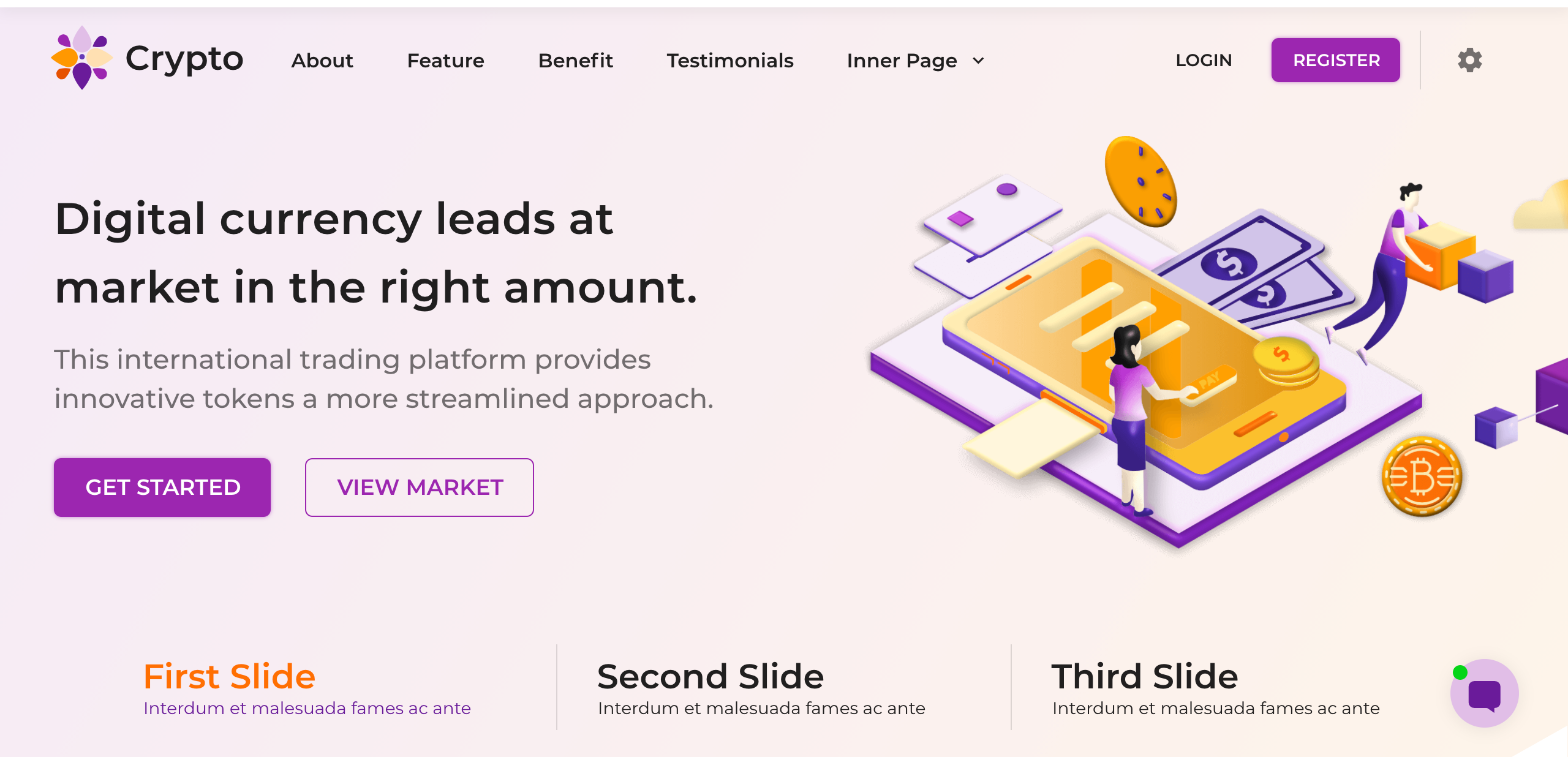
Banner Slider
Banner and Slider ussualy placed on first section of hompage. And all of this template uses the Banner Slider.
The banner slider components code is in components/Home/BannerSlider
The slider containing 3 type of banners, Text-Image, Image-Text, and Text-Image-Vertical. By default it uses all type banner as horizontal slider. If you need only a single banner without slider, You have to make some modification in the code like bellow:
Text-Image
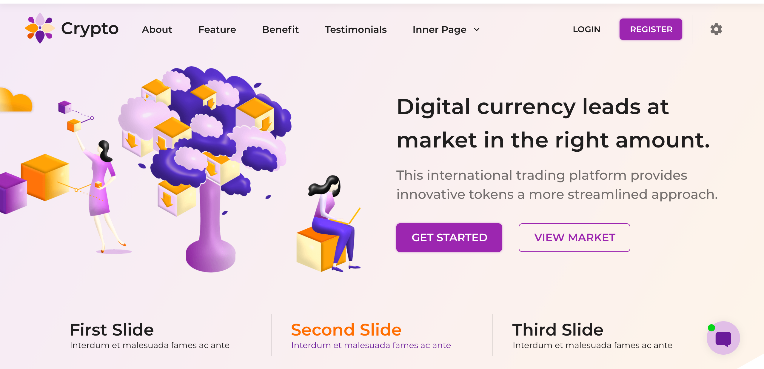
Image-Text

Text-Image-Vertical
Horizontal Slider mode structure
// components/Home/BannerSlider
<div class="carousel" v-if="loaded">
  <slick>
    <div class="slide" id="slide1">Banner 1</div>
    <div class="slide" id="slide2">Banner 2</div>
    <div class="slide" id="slide3">Banner 3</div>
  </slick>
</div>
Single Banner mode structure
Unwrap slick component and use only one .slide element
// components/Home/BannerSlider
<div class="carousel" v-if="loaded">
  <div class="slide" id="slide1">Banner 1</div>
</div>
Theme and Layout(RTL)
Theme Color
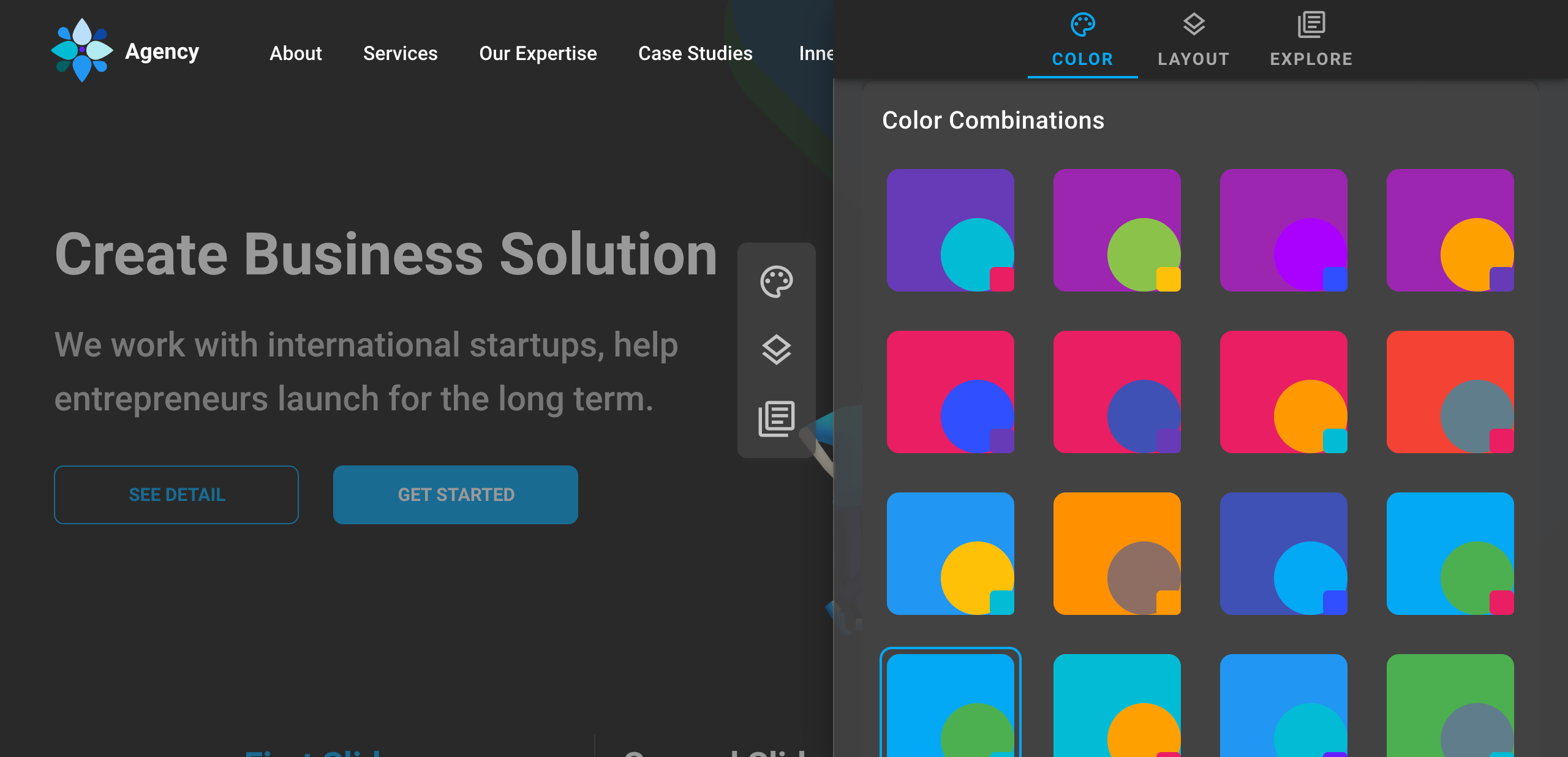
This template has 24 Themes with dark/light appearance. You can change the layout via theme panel but not permanently. To make the layout permanent just follow this step.
- Open
/config/vuetify.options.js - Open the available theme list
/config/theme.txt -
Then change the
themevalue. For theme color, since nuxt.js cannot import external file in the config, so please pick and copy manually one of theme value from/config/theme.txtto/config/vuetify.options.jsinconst palette - Example theme to pick:
greenLeaf: { primary: colors.green.base, // primary main primarylight: colors.green.lighten4, // primary light primarydark: colors.green.darken4, // primary dark secondary: colors.blueGrey.base, // secondary main secondarylight: colors.blueGrey.lighten4, // secondary light secondarydark: colors.blueGrey.darken3, // secondary dark anchor: colors.green.base // link } -
And here's the available themes api:
Key Type Available Value Example theme.themes:Object '...palette.oceanBlue','...palette.greenLeaf',
'...palette.greyscale','...palette.cloud',
'...palette.violet', etctheme = { ...palette.oceanBlue } -
!IMPORTANT
If you change the palette const, don't forget to update this following files as well
** Crytpo Theme:/crypto-theme/components/GradientDeco/GradientDeco.vue
Make sure the const palette has same value as vuetify.options const palette
Layout Direction
This template also support for RTL direction. To set RTL as default direction please follow this step.
- Open
/composables/uiTheme.js - Set useRtl to true
export const useRtl = () => (useState('rtl', () => true)); - Finally Open
/nuxt.config.tsThen please adddir: 'rtl'in// nuxt.config.ts export default defineNuxtConfig({ app: { head: { // the rest code htmlAttrs: { dir: 'rtl' }, } // the rest code } })
Theme Illustration
Artwork Illlustration as part of UI visual explanation of a text, concept or process. 3D or 2D styles are in trending now, and this template has both. To configure the style mode please follow tihs step
- All images assets listed in javascript files, so please open
static/images/imgAPI.js - By default this template uses 3D style, to switch to 2D style please search
...img3d -
Then change from
...img3dto...img2d, and reverse allowed as well. -
Example:
From

// imgAPI.js
    crypto: [
        ...img3d.main,
        // rest images
    ],
    cryptoInner: [
      ...img3d.inner
    ]
To

// imgAPI.js
    crypto: [
        ...img2d.main,
        // rest images
    ],
    cryptoInner: [
      ...img2d.inner
    ]
Youtube Config
This template use Vue Youtube a simple vue component acting as a thin layer over the YouTube IFrame Player API. To use this feature we recommend to use https in production. If not there will be some warnings in browser console related cookies and security.
You can disable this feature by open config/youtube.js then set set use: false.
Set Language

-
To set default language
- Open
/nuxt.config.ts - change
defaultLocale: 'en'to other initial locale i.e.idfor Bahasa Indonesia - And also for
vueI18n: { fallbackLocale: 'en' }to other fallback locale i.e.idfor Bahasa Indonesia - For arabic with RTL layout, please add
dir: 'rtl'inapp.head.htmlAttrs: { lang: 'ar', dir: 'rtl' } - Then open
composables/uiTheme.js - Set useRtl to true
export const useRtl = () => (useState('rtl', () => true));
- Open
-
Add new language
-
By default, nuxt-i18n expects your translations to be organised as such by create new language JS library in
/static/lang/[localCode]/└── lang ├── en-US.json └── de-DE.json - You can check the available local code here https://github.com/ladjs/i18n-locales
-
Then register it in
/lang/languages.jsexport default [ { code: 'de', iso: 'de-DE', name: 'Deutch', file: 'de-DE.json', dir: 'ltr' }, { code: 'en', iso: 'eng-US', name: 'English', file: 'en-US.json', dir: 'ltr' } ]
-
By default, nuxt-i18n expects your translations to be organised as such by create new language JS library in
-
Put the messages to the Vue Components
- Pick one of sample Components with cointaining text, i.e
/componens/Footer.vue - Basically the message return is String. And next step is replace/add every string in components
-
Add a translated text inside components
<p> {{ $t('agencyLanding.footer_paragraph') }} </p> -
Then run the server
npm run dev.
- Pick one of sample Components with cointaining text, i.e